Lifehacks for Jewellery Photography at Home (That Actually Make a Difference)
- May 4
- 6 min read
Updated: May 5
The Image Problem Nobody Talks About
Here is a concrete signal: jewellery photography is the second most cited reason a shopper abandons a product page without purchasing, right behind price. The piece is beautiful. The price is fair. But the photo looks like it was taken in a car park at dusk. So the buyer clicks away.
Most independent jewellery makers know this. They feel it every time they post, and the engagement flatlines. They see it when their product sits in a cart and never converts. And yet the default solution — hire a professional photographer for every drop, every restock, every seasonal update — costs between £990 and £1,990 per session for a standard batch. Good for the big established jewellery brands. But for a sustainable operating rhythm for a growing brand — barely affordable.
And this is exactly where Home Photography steps in.
Why Home Photography Usually Goes Wrong
The typical home setup fails for three specific, observable reasons.
First: the light is wrong. Overhead ceiling lights and warm household bulbs cast yellow or orange tones on metal and stone. Gold turns muddy. Silver looks grey. Gemstones lose their fire. The camera tries to compensate automatically and usually makes it worse.
Second: the background competes. A wooden table, a marble worktop, a piece of fabric with a visible seam — all of these pull attention away from the piece itself. The eye does not know where to land.
Third: the phone is doing too much guessing. Without manual control, your camera app is making exposure, focus, and colour decisions designed for general scenes — not for a 12mm stone sitting against a white surface.
And setup problems have setup solutions.
The Jewellery Photography Lifehacks for Home Shoots
1. Shoot Next to a Window, Not Under a Light
The single highest-impact change you can make costs nothing. Natural daylight from a window — ideally north-facing in the Northern Hemisphere, or any window on an overcast day — gives you a soft, diffused, colour-accurate light source.
Place your piece within 30–60 cm of the window. Do not use sunlight directly hitting the piece (it creates harsh shadows and blows out highlights on metal). An overcast day is your best friend.

Avoid: ceiling lights, ring lights placed directly above, and kitchen spotlights.
2. Use a Foam Board Reflector to Kill Shadows
This costs approximately £1.50 at a craft shop. A white foam board placed on the opposite side of the piece from your window bounces light back and fills in the harsh shadow that the window creates on one side.
Without it: one side of your ring is bright, one side is in shadow.
With it: the metal reads evenly, the stone shows depth on both sides.

Black foam board does the opposite — it deepens shadows, creates drama. Useful for darker lifestyle shots.
3. Lock Your Exposure and Focus Before You Shoot
On any smartphone, press and hold on the specific part of the image you want in focus. This locks both the focus point and the exposure reading to that spot — stopping the camera from continuously adjusting while you compose.
For jewellery: lock focus on the stone or the most detailed element of the piece.
The sun icon slider that appears on iPhone after you lock focus lets you manually adjust brightness up or down. Dial it down if the metal is blowing out (going pure white with no detail).
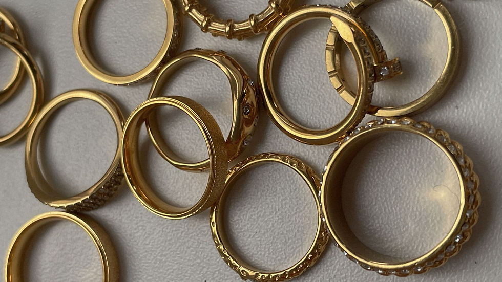
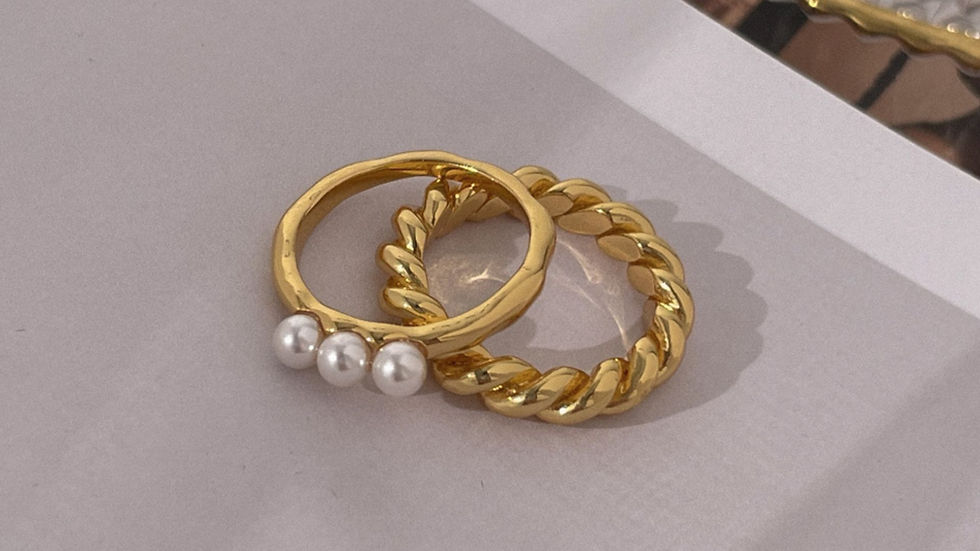
4. Choose Your Background Deliberately
Background paper rolls and texture printouts are everywhere in DIY photography advice. Skip them entirely.
Printed textures look exactly like what they are — printed textures. On camera, at close range, the flatness reads immediately. A marble-effect paper sheet does not behave like marble. It does not catch light the same way. It does not have the micro-depth that makes a surface look real.
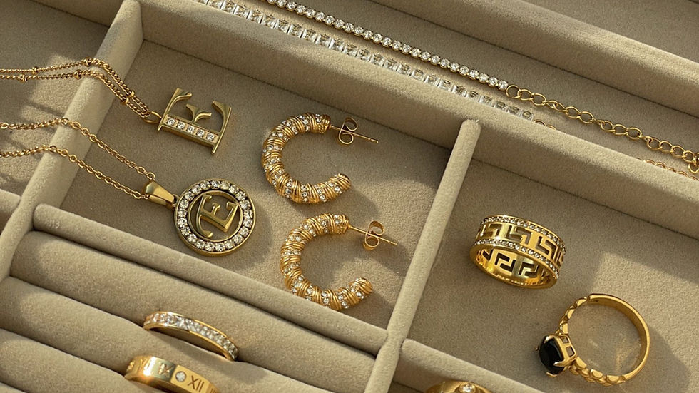
Instead, go to Zara Home and spend £20–£40 on actual objects:
A marble coaster or small marble slab — the variation in the stone is genuine, it reflects light differently at different angles, and it communicates luxury without any effort
A wooden cutting board or serving board — tight grain, tactile, works beautifully with silver and earthy tones
A lacquered or ceramic tray — clean surface, slight sheen, excellent for rings and stacked pieces
A jewellery box or a small hinged box — instantly adds context, tells a story about the piece, and photographs well open or closed
These are not props. They are surfaces with real depth, real reflection, and real texture that a camera picks up accurately.
The practical bonus: they are reusable across every shoot, they look intentional in behind-the-scenes content, and they cost less than one session with a retoucher fixing a flat background in post-production.
What the background communicates matters, too. A marble slab reads luxury and permanence. Raw wood reads handmade and considered. A dark lacquered tray reads editorial. Choose based on what your brand is — not based on what was easiest to source.
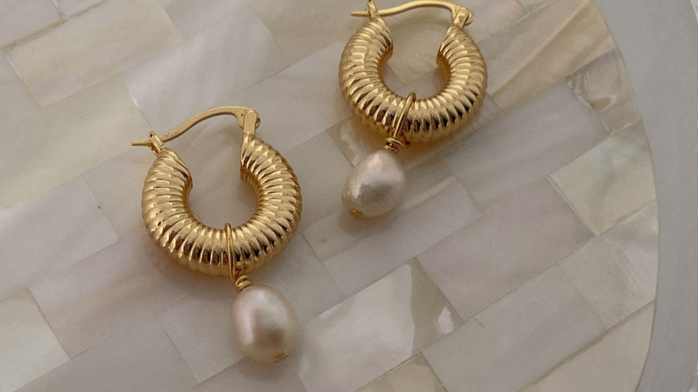
5. Style the Piece So It Can Stand on Its Own
A ring rolling on its side. A necklace in a pile. Earrings that do not match in height. These are styling problems, not camera problems.
Tools that cost under £5 each:
Blu-Tack or wax to prop rings upright at the correct angle
Ring cones (bamboo or resin) to display rings standing
Invisible monofilament thread to hang pendant necklaces mid-air
A folded business card tucked beneath a necklace to create a gentle curve
The camera cannot fix a piece that is not styled. Style it first, then photograph it.
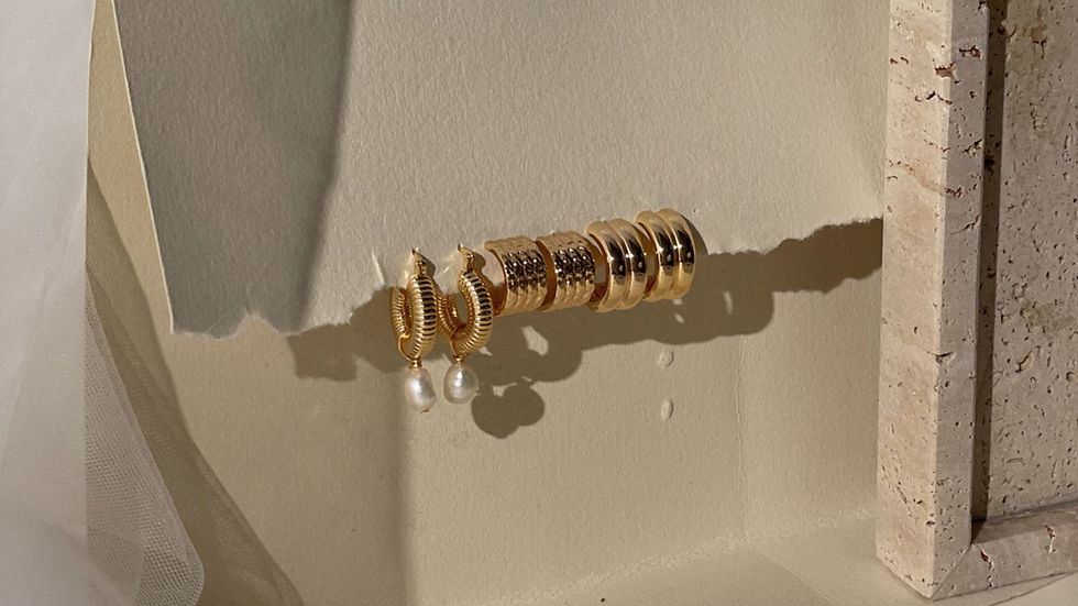
6. Photograph Multiples Together for Scale and Context
A single ring against a white background gives no sense of size. Shoppers cannot tell if it is 6mm or 16mm wide without context.
Solutions that do not require a human hand in shot:
Include a second piece (stacked rings, paired earrings) to create visual scale reference
Place the piece on a surface with a recognisable texture (a book, a tray, a small stone)
Photograph two or three pieces from your collection together — this also creates content for a collection launch post without extra effort
7. Shoot in Portrait Mode Only for Hero Shots
Portrait mode (also called Depth Effect on some Android devices) uses computational bokeh — it blurs the background and creates a shallow depth of field that makes your piece appear to pop off the surface.
Use it for: hero images, the primary product image on your website, and cover posts.
Do not use it for: images where you want the full piece in sharp focus (some modes blur earring tips or chain ends), e-commerce images where the background needs to be clean and replaceable, or detail shots.
Portrait mode is a tool with a specific use case, not a setting to leave on permanently.
8. Edit for Consistency, Not Just for Beauty
A product page or Instagram grid where each image has a slightly different colour temperature, brightness level, and crop ratio looks like it belongs to four different brands.
Editing basics for jewellery photography — achievable in Lightroom Mobile (free) or Snapseed (free):
Temperature: bring it slightly cool (towards blue) to make silver and white gold appear crisp and accurate
Highlights: pull them down if metal is blowing out
Clarity: a subtle increase (around +10) sharpens stone facets and surface texture without making the image look over-processed
Crop ratio: decide on one ratio (4:5 for Instagram, 1:1 for product grids) and apply it to every image in a shoot
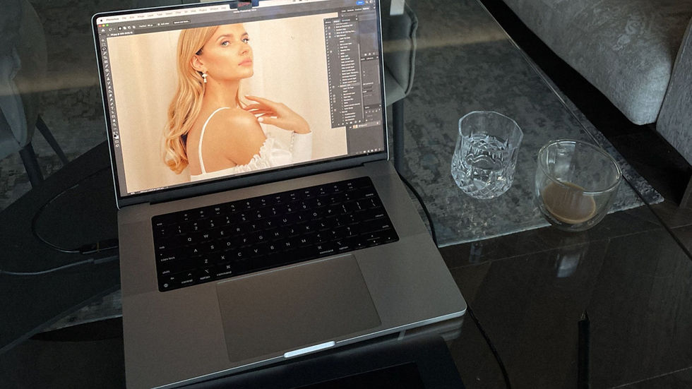
Create a preset from your first edited image and apply it to every other image from the same session. This is what makes a grid look like a brand, not a collection of experiments.
When DIY Reaches Its Limit — and What to Do About It
These lifehacks will take most jewellery makers from unusable images to good, consistent images with equipment they already own or can acquire for under £25.
But there is a ceiling. And it shows up in specific situations:
Photographing a fine chain against a white background (chain disappears)
Very dark or very light stones, where the camera consistently misreads the exposure
Model or lifestyle shots that require composition, direction, and post-production
Images for a major collection launch where inconsistency costs sales
At that point, the question becomes whether to build the skill further — or to brief someone who already has it.
Chocianaite's Smartphone Jewellery Photography Bootcamp (£490) teaches the complete methodology for shooting jewellery at home on a phone, over four weeks with live feedback on your actual images — not pre-recorded theory on someone else's work.
The course covers lighting setups, styling, editing workflows, and social media image strategy for jewellery brands specifically.
Every week, a product page with poor imagery is a week of reduced conversion. The gap between a strong product image and a weak one, at equivalent traffic levels, is typically a 20–35% difference in add-to-cart rate.
That is not an aesthetic gap. That is a revenue gap. The entry cost to fix it — a foam board, a £15 tripod, a window, and 90 minutes to learn your phone's manual settings — is low enough that there is no practical reason to delay past this week.
Chocianaite launched the Ultimate Jewellers' Playbook — a community for jewellery business owners on how to navigate the business, sell and market their jewellery, and DIY photography. Join today, start with a free membership.


Comments